#1 Time Animation

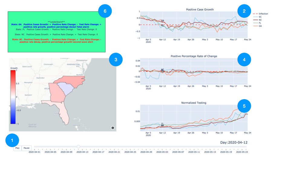
Press play to view each visual dynamically over time! The dashboard begins on April 1st and runs through the most recent data pull (May 25th).

#2 Positive Case Growth

Positive case growth is a metric that allows us to understand what stage of logistic growth each state is in. Generic placeholder image

  • ~ 1 indicates exponential growth.
  • Between 0 and 1 indicate slowing growth but still, more new cases this week than last.
  • 0 indicates the inflection point: the same amount of new cases this week as last.
  • Between 0 and -1 indicates slow decay. Less cases this week than last but not dramatic.
  • Less than -1 indicates dramatic decay.

  • A 7-day smoothing average is applied to remedy daily spikes due to reporting inconsistency.

    #3 The Map

    The Map displays positive case growth geographically.

  • Red color indicates the state is experiencing growth.
  • White indicates the state is at an inflection point.
  • Blue color indicates the state is experiencing decay.
  • The darker the red or blue, the more intense the growth or decay.

  • #4 Positive Percentage Rate of Change

    The Positive Percentage allows us to supplement positive case growth with testing information.
    Screenshot Screenshot
    When we see positive case growth, naturally we ask, is this because we are testing more or is it because the virus is spreading? This is why we look at the positive percentage dynamically. If the positive percentage is growing and positive cases are also growing, it indicates the virus is spreading. If the positive percentage is decaying, and positive cases are growing, it indicates that we are testing more. Screenshot

  • A positive rate of change indicates positive percentage is growing.
  • A negative rate of change indicates positive percentage has begun decay.
  • A rate of change of 0 indicates positive percentage is decreasing linearly.

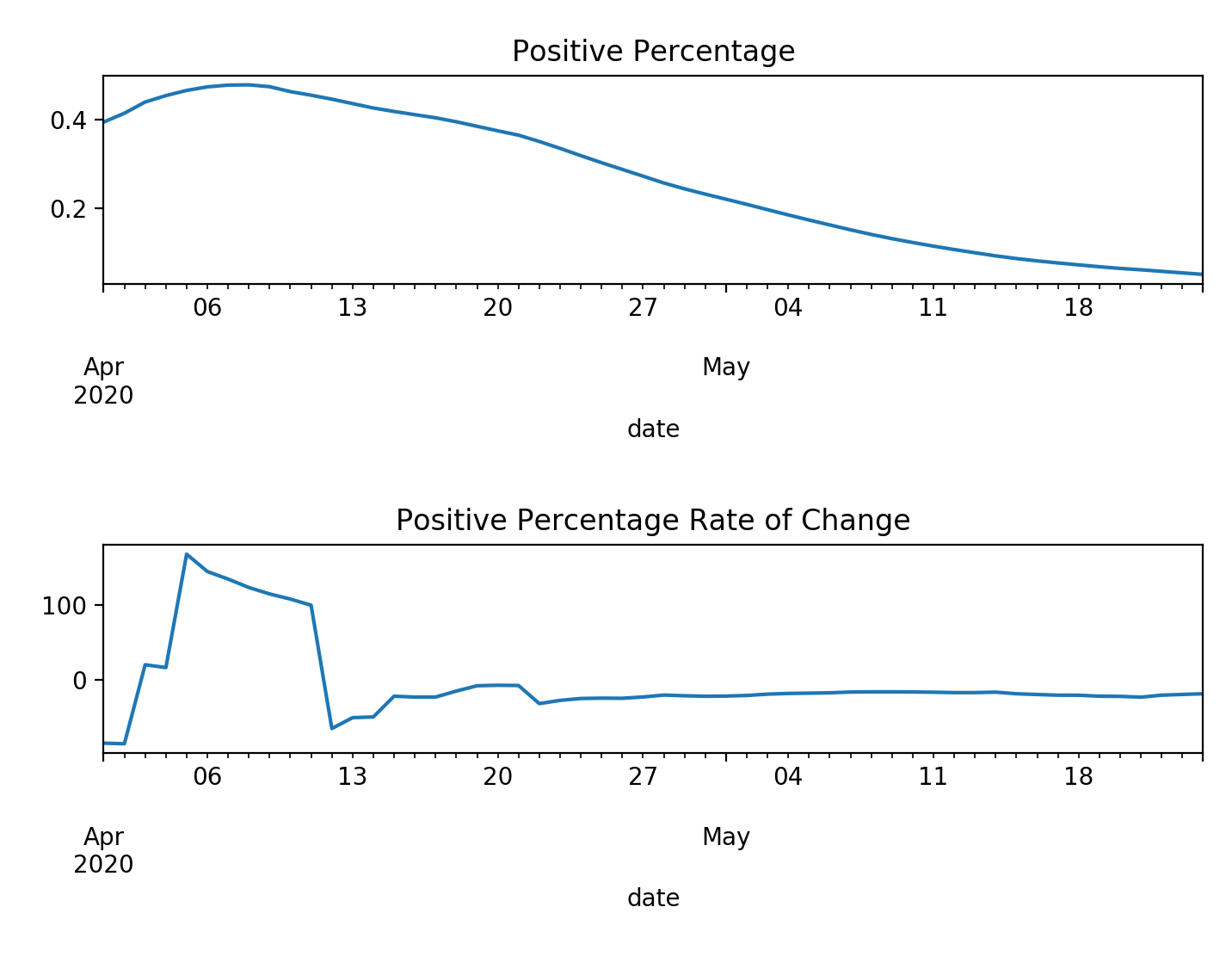
    A 7-day smoothing average has been applied to remedy daily spikes due to reporting inconsistency.

  • #5 Normalized Testing

    Normalized testing indicates how each state has ramped up testing over time.
    Screenshot
    We are dividing by total number of tests in the last week by each state's population to look at testing in the context of each states. We all know Wyoming does not need as many tests as New York!

    #6 The Leaderboard

    The Leaderboard's purpose is to summarize information from the other visuals and alert when positive case growth is not giving us the complete picture of what is going on.

    1. The Leaderboard is sorted on positive percentage rate of change. The first state listed has the lowest rate of change and the last state listed has the highest rate of change.
    2. When positive case growth is negative but positive percentage growth is positive, the text becomes red and bold. This scenario indicates that despite positive cases are decaying, we are seeing an increasing percentage of positive cases. This could mean the state is under-tested and positive case growth could return in the near future.
    3. When positive case growth is positive but positive percentage growth is negative, the text becomes blue and bold. This scenario indicates that despirte positive case growth, we are seeing a decreasing percentage of positive cases. This could mean the the state has increased testing leading to more positive cases along with negative cases.